Monday, 8 December 2014

Print: Project 5

 
Research:
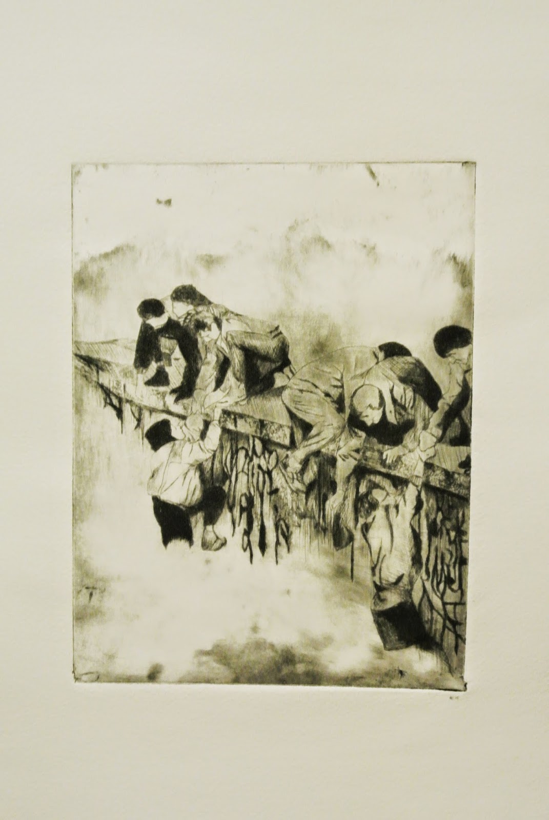
To start the print project we were asked to create 20 sketches that related to the theme of 'monument.` For this I researched the words monument and monumental, as a result of this I started researching monumental events in history, and this led me to articles and images of the Berlin wall. These images were a mixture between old photographs taken at the time and more recent photograph of the wall today. today parts of the Berlin wall are spread all over the world in countries such as The UK, Jamaica, India and South Korea to name a few. This interested me as I have seen some of the pieces that are in England, and that have been repainted. (some of the pieces were repainted with things that represent freedom and peace in the countries that they are located, some have remained the same and there are a couple of pieces in the RAF museum that have been painted with facts and the history of the wall.) I thought that some of these images would make great prints.
 
Printing:
The image that I used to create my dry point print was an old photograph of the Berlin wall when it was still up and when people first started to protest on top of it. I really liked this image and thought that it would translate well as a print.
After I had done my prints I decided that I wanted to incorporate some images of how some of the pieces looked today, I decided that I would collage and paint over the top of some of the prints to make them look graffitied on, and to make them look more interesting. 
I think that my prints worked really well and I really enjoyed making them, as dry point is one of my favourite techniques. I feel that to develop these prints further I would like to created more and develop the graffiti idea by using actual spray paint and stencils to create the images over the top, instead to just normal acrylic paint, to make it feel more realistic and add a different kind of mark and texture.   


Wednesday, 3 December 2014

Joseph Mallord William Turner


"Born London ,1775, died London, 1851. Turner was the most original and imaginative figure in the history of English landscape painting." (Andrew Graham-Dixon, Art the definitive visual guide, 2008, star standard industries, Singapore)
  • JMW Turner-Snowstorm: Hannibal crossing the alps, 1812 (forceful) - trying to show that nature is so powerful and that people are quite insignificant. Turner became obsessed with light and nature, reviving myths in a modern story.
Quotes;
  • "Every time I look in the mirror I see a gargoyle" - Timothy Spall, Quoting Turner.
  • "I didn't paint... to be understood I wish to show what such a scene was like" - Turner.
  •  "Atmosphere is my style" - Turner.
  • "Indistinctness is my fault" - Turner.

  • "The motif is unimportant to me, what I want  to reproduce is what stands between the motif and me." - Monet.

Turner-War: The exile and the rock limpet (1842)

Turner-The Thames above Waterloo Bridge (1830-1835)

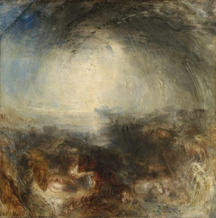
Turner-Shade and darkness: The evening of the deluge (1843)

Turner-Fire at the grand storehouse of the tower of London (1841) 

Turner-Light and colour - Goeth's theory (1843)

Turner-Peace Burial at sea (1842)

Turner-Rough sea (1840-1845)

Turner-Colour trails (1791)

Turner-A tree, with a line of trees beyond


Saturday, 29 November 2014

Wednesday lectures: Seb Patane


Wednesday lectures: Harry Meadley


22.10.14

The Panj Piare Project; the friendship between artists [5 artists] /cosplay.(2013)
  • Level one (based on computer games)
  • Digitally printed vinyl
  • Mystery shoppers

  •  Still stuck on stage 2
  • Multiple personalities
  • Clap with on hand (sound piece)
Leeds weirdo club - studio


Wednesday lectures: Nathan Barlex


8.10.14

Painting at home - house he grew up in - [Munch - The scream]
William Blake - God's judging Adam
[Art you have at home]
Painted dinosaurs:
  • Painted dinosaurs into Monet's landscapes.

Wednesday lectures: Edwin Burdis


1.10.14

Film:
  • About his love of England and the way that it looks. (personal opinion) Singing and voices in the background.

  • The plumbers [hygienic gaze] - clothes
  • Paul wipe wonder (2014)
  • The fruit machine - huge painting that tells the story of another dimension and the human race.
  • Mega dairy pig farm - painting and sound
  • [performance art] 


Wednesday lectures: Hassan Khan


24.09.14

Hassan khan - sound/ film artist
  • Connected to patronism-artist/context
Decoy - intervening in opening dinner [restaurant, replaced table with a pile of pine (wood)/ worked with four actors, during the opening of his exhibition.
  • Dead dog speaks - animation (about speech and language)

  • Blind ambition - film shot on a phone/ silent with the voices dubbed over afterwards.
Memories
  • 17 and in AUC (2003) - four hours for fourteen nights - drinking, smoking and remembering university. Only spoke about memories - could not hear or see the audience (complete isolation)
Jewel (2010) - idea in 2006/ two men dancing around a speaker in the street - relating to history [dance - personal and cultural]


Work:
  • Reading the surface: 100 portraits, 6 locations and 25 questions
  • 17 and in AUC
  • Decoy
  • Tabla dub
  • Transmission
  

Wednesday lectures: Ann Bukanta


17.09.14

Ann Bukanta is the head of fine art at the Walker art gallery in Liverpool. (1877-contempory art)
[art inventions]
  • Lady Lever art gallery
  • Sudley House
Video artists:
  • Marcus Coates - Journey to the lower world
  • Bill Viola - Observance
Contemporary art inventions:
  • Collections
  •  Buildings
  • People
Performance art:
  • David Brinkworth - The gallery cleaning service (2004)
  • David Hoyle - Queering the walker
  • Aaron Williamson - Eavesdropper
  • Richard Strange - A sleek, dry, yell
 Ritual bodies (2004):
  • Jacqueline Wylie
  • Phil Davenport
  • Margret Cahill-Gathering
  • Mike Chavez-Dawson
Changing places (2007):
  • Phil Sayers - Eve with hindsight
  • Rikke Lundgreen - Ascension

Show: Project 4


During the show project we had to create an exhibition in which we would show all for the work that the other groups had been creating during the last two weeks (sound, listen, film and print). as a group we decided that we wanted to create an exhibition that was very different to a normal white wall gallery exhibition and very different to the exhibitions that the other three groups had created in the previous weeks. So was all agreed that we wanted to create a student flat in the studio where we would show all of the work and the opening of the exhibition would been like a stereotypical flat party. However this turned out to consist of a lot of work, we had the technicians put up the wall to the flat and add windows and doors, to make it feel like a real flat. original we wanted to add a ceiling, however we were told that it wouldn't be possible because of health and safety and that it would be a fire rise, knowing this we decided that not having a ceiling would work and would make people remember that it wasn't a flat and that it was still the studio and would break the illusion and make it feel more like a fine art piece, so this set back worked in our favour in the end.
To fill the flat we brought things from our own flats that would more it look more lived in and realistic and use fridges, pieces of carpet and chairs that we found around the John Lennon building, we also went out skip diving to find the flooring and the windows to make it seem more real, but not spend too much money.   
when we had everything (that made it feel like a flat) in it started to look pretty realistic, but we decided that we had to try and clean as much paint and ink of the floor, the walls and around the sink to make it look less like an art studio. We also put up flyers and posters around the sink and in the dinning area, which made the space look ten time better and more homely and lived in.
 then on the Friday of the opening we had all the work to put up, we agreed that the films and sounds would play on laptops in each of the bed rooms and that the listen and print work would be put on the walls to blend in with the posters, but some would also go on the desks to look like the work of the student that lived there.
Over all I think that the exhibition looked great and that the idea worked really well, and was a lot more interesting than just having the work stuck on the walls. I think that it was a shame that it was only up for such  short amount of time, considering the work and effort that we all put into it, however I think that the visitors we had enjoyed it and were a little bit surprized to see what we had created. However I do think that some of the work was lost and over shadowed by everything else that was going on, and that some people forgot or didn't realise there was work on display. 


Friday, 28 November 2014

Film: Project 3


During the film project we were asked to make a short film on pretty much any subject or topic of our choice, but were asked not to make in relation to a hidden deeper meaning. To start the project we read an extract from a book about cannibalism, and also watched an Asian film that was about these old women having a conversation and talking about music and there husbands and an ex boyfriend of one of the women that must have been one of the older women's daughters. The film then jumped to a scene in a gym with the women in the middle and children playing badminton around them, I wasn't entirely sure what this film was about as it seem quite random and the people in it were speaking in a foreign language and you had to read the subtitles to understand what they were saying. This meant that you either had to focus on what was happening on the screen and what they were doing or focus on the subtitles to understand what they were saying as it was hard to do both.
I had never made an art film before, but decided that I wanted it make it in relation to the last project that we did, which was listen, and I decided that I was going to make a film based on conversations and in particular conversational gestures that people make with there hands without actually thinking about what they are doing, and how taking these images out of context and removing the sound can change the way that we understand the meaning of the conversation. I found that it was quite difficult to actually create the film and that it isn't as simple as it looks, you have to make sure that the lighting is right and not too dark or too light and if you are holding the video camera, making sure that you hold it steady and everything that you want in the video is in frame and in focus.
However out of the projects that we have done so far I think this is the one that I have enjoyed the least as I found that it is a lot more difficult than you would think to capture good footage, although I did quite like editing the video even tough I found that quite hard too.

Saturday, 18 October 2014

Biennial week – The old blind school


At the old blind school they had the biennial exhibition on and there were a lot of varying artists that had work on display. The old blind school actually a derelict building before the biennial opened the exhibition on, this meant that the building was very run down and dilapidated looking and all the paint was flaking and falling off the walls. This made the setting of the exhibition much more interesting than if it had been in a normal gallery. And in some places I preferred the actually state of the building and walls to the art work on display, especially the mural on the ceiling as it was really colourful and eye catching even though it wasn’t part of the exhibition, and it almost looked as if it was going to fall down.

I think that the old blind school was the least impressive out of all the galleries I visited during the Biennial, however there were some pieces that I did quite like, but not as much as at the other galleries.  


Biennial week - The Tate and The Walker gallery


At the Tate Liverpool they had on the ‘Claude Parent’ exhibition as part of the biennial. I found this exhibition extremely interesting as it was very unusual and like nothing that I had ever seen before, I particularly liked the way that you had to actually stand on the art work to view the other art on display.  I found that I viewed the art differently as I was very aware of the surroundings and what was happening around me and you just automatically viewed the work in a different way without really noticing. I have been to the Tate quite a few times and always enjoy the more permanent exhibitions.


At the Walker gallery there was the John Moore’s painting prize exhibition, I really enjoyed this exhibition and think that it is one of my favorite exhibitions that I have seen during this week. What I found particularly interesting was the way that the exhibition had been put together and the fact that it was right next to one of the galleries with the much older paintings in, and the way that that gallery had an older, darker more historical feel to it and then you walked though some doors and you ended up it a very bright, white more boxy room that seemed much more clean and the paintings were considerably brighter and more colourful. I feel that this was a really interesting contrast and worked really well and you could easily see that you were going to view much more modern paintings, I think that if the older paintings were in a white wall gallery, with very bright lights they would look very out of place and strange and the same with the modern paintings been in a darker gallery with more decorative walls, they just wouldn’t look right.


In the John Moore’s painting prize exhibition I thought some of the paintings were really impressive and captivating/thought provoking, such as:

·         Jo Berry’s – untitled 2013,(this is a painting of a woman lying in a field of on some grass), I found this intriguing as the whole painting is completely out of focus, I feel this makes the piece a lot more interesting and engaging than if it was all in focus and perfectly clear, however when you first look at the painting or look at it from a distance of just glimpse at it, your brain sort of makes it more clear and you just think that your eyes haven’t focused properly yet, but when you actually look more closely at the piece you can see that it meant to look that way, and then the more that you look at it the more you can make out the shapes anymore and it becomes an indescribable blur.


·         Nicholas Kulkarni’s – Tracer,( this is an abstract painting with a blue background), I was interested in this piece as it was quite different to the painting around it and it is just a very pretty, clean painting, it also reminds me of something (maybe another piece) that I liked but I can’t think what it is.


·         Frank Pudney – people69104, (another abstract painting made up of tiny marks), I think that this was one of, if not my favorite piece of the whole exhibition, as I find it extremely eye catching yet subtle and I think that it is one of the most beautiful painting I think I have ever seen.


·         Hynek Martinec – every minute you are closer to death,(large black and white painting), I was struck by this painting not only because of its vast scale in comparison with the work around it but because of its intriguing subject matter, this painting is of a deer lying on a table, surrounded by fruit and bottles and there is a skull painting/reflection in the background of the image. The deer’s head is the only part of the painting that is a hundred percent clear and in focus. I can’t really tell if the deer is alive or dead or just about to die and I think that is part of what makes this piece interesting, along with the title. I also think the fact that it is in black and white makes the image more captivating and I think that if it was in colour it wouldn’t have as much of an impact.


There was also a small exhibition about the dazzle ships, as they had four dazzle ship prints that show the work of Edward Wadsworth, the concept of the dazzle camouflage was developed by Norman Wilkinson in 1917. These prints were wood cut prints and they were just black and white and about A3-A4 in size. I really like these prints and they were even more interesting as I had already seen the Carlos Cruz-Diez dazzle ship at the waterfront.


In the walker they also had a gallery that was full of mainly marble sculptures and busts, I like a lot of them but the main one I found interest in was a sculpture entitled ‘Tinted Venus’ by John Gibson (made of marble and wax).  The sculpture is of Venus (nude) holding an apple with fabric (made out of marble) covering the lower left side of her body. Her lips are tinted red and her head is slightly tilted and there is a tortoise by her foot. I don’t truly know what it is about this sculpture that I like so much, it just really caught my eye and genuinely made me stop and look properly.